A bar chart is used to visually represent and compare the values of different categories or groups of data. It consists of rectangular bars of lengths proportional to the values they represent.

In a government proposal, graphics are essential for conveying information visually and engagingly. They can be utilized to enhance the visual representation of information. When you do it right, using visuals in your proposal makes it simpler to evaluate. Graphics point out the most crucial and powerful aspects of your solution. Pictures can quickly show what makes your offer special, convey how compliant your response is, illustrate your solution, and create the mood for your proposal. These objects are chosen strategically to communicate the proposal’s content effectively. In this blog, we will be talking about the types of quantitative data graphics. Let’s take a look!

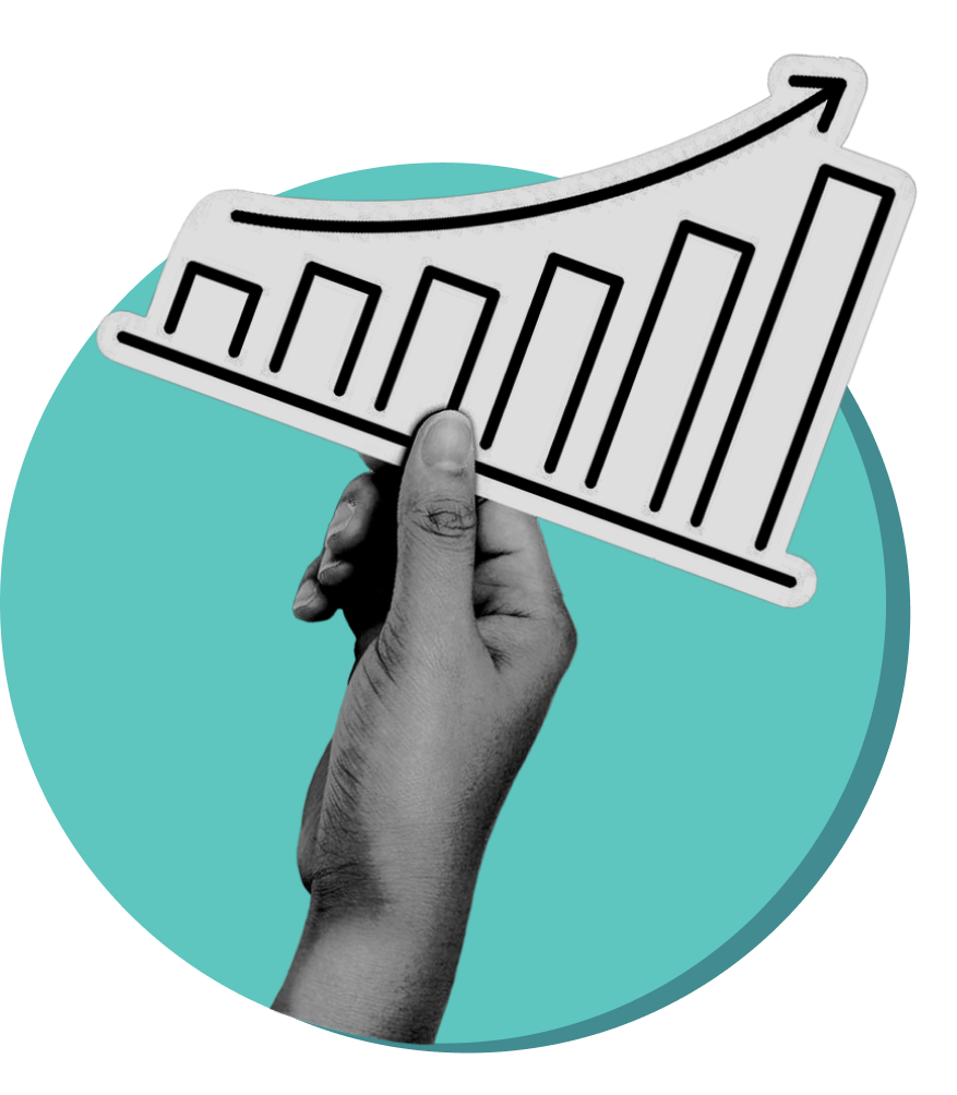
A bar chart is used to visually represent and compare the values of different categories or groups of data. It consists of rectangular bars of lengths proportional to the values they represent.

A bubble chart is used to visually represent three sets of data in a two-dimensional space. It is an extension of a scatter plot, where each data point has three values: two for the coordinates on the X and Y axes, and one for the size of the bubble. The size of the bubble indicates the magnitude or value of the third variable.

A pie chart is used to represent data in a circular graph, where the entire circle represents 100%. It is primarily employed to illustrate the distribution or proportion of parts within a whole. Each “slice” of the pie corresponds to a category or component of the total, and the size of each slice reflects its relative contribution to the whole.

A line chart is used to visualize and display data points over a continuous interval or period. It is particularly useful for illustrating trends and patterns in data.

A Spiral Chart, also known as a Spiral Diagram, is a visual representation that displays information in a spiral format such as Project Planning, Risk Management, Market Analysis, Process Improvement, etc.

A Radar chart, also known as a spider chart or web chart, is used to display multivariate data in the form of a two-dimensional chart. It is particularly helpful in comparison of Multiple Variables, Performance Evaluation, Strategic Planning, etc.

1. Scatter plot: This is the most common type of point chart. It displays data points as individual dots on a two-dimensional plane. The position of each dot is determined by its corresponding values on the x and y axes. Scatter plots are useful for visualizing relationships between two numeric variables, identifying outliers, and exploring trends in data.

2. Point-and-figure chart: This is a specialized type of chart used in technical analysis of financial markets. It plots the price movements of a security without regard to the time interval between them. Each point on the chart represents a change in the price of a predetermined amount (e.g., $1). Point-and-figure charts are useful for identifying trends and support/resistance levels in stock prices.

Tables help arrange information neatly in rows and columns. You can use them to show numbers, describe things, or summarize what others have already written. Tables also make proposals easier to read by taking out numbers or lists from the text.
When incorporating these key objects, it’s crucial to maintain clarity, simplicity, and alignment with the overall design of the proposal. Compliance is also incredibly important– if the government wants your graphics to be 10pt Arial, stick to 10pt Arial! The goal is to enhance understanding and engagement while presenting information visually compellingly. These strategies will help your project shine and be at the top among competitors!
Need help with your proposal graphics?
Share:

Sign up to receive the design tips and strategies relevant to government contracting.
In a government proposal, graphics are essential for conveying information visually and engagingly. They can be utilized to enhance the visual representation of information. When you do it right, using visuals in your proposal makes it simpler to evaluate. Graphics point out the most crucial and powerful aspects of your solution. Pictures can quickly show what makes your offer special, convey how compliant your response is, illustrate your solution, and create the mood for your proposal. These objects are chosen strategically to communicate the proposal’s content effectively. In this post, we will be talking about the type of Quantitative Graphics. Let’s take a look! Check out the guide for more helpful tips!

A bar chart is used to visually represent and compare the values of different categories or groups of data. It consists of rectangular bars of lengths proportional to the values they represent.

A bubble chart is used to visually represent three sets of data in a two-dimensional space. It is an extension of a scatter plot, where each data point has three values: two for the coordinates on the X and Y axes, and one for the size of the bubble. The size of the bubble indicates the magnitude or value of the third variable.

A pie chart is used to represent data in a circular graph, where the entire circle represents 100%. It is primarily employed to illustrate the distribution or proportion of parts within a whole. Each “slice” of the pie corresponds to a category or component of the total, and the size of each slice reflects its relative contribution to the whole.

A line chart is used to visualize and display data points over a continuous interval or period. It is particularly useful for illustrating trends and patterns in data.

A Spiral Chart, also known as a Spiral Diagram, is a visual representation that displays information in a spiral format such as Project Planning, Risk Management, Market Analysis, Process Improvement, etc.

A Radar chart, also known as a spider chart or web chart, is used to display multivariate data in the form of a two-dimensional chart. It is particularly helpful in comparison of Multiple Variables, Performance Evaluation, Strategic Planning, etc.

1. Scatter plot: This is the most common type of point chart. It displays data points as individual dots on a two-dimensional plane. The position of each dot is determined by its corresponding values on the x and y axes. Scatter plots are useful for visualizing relationships between two numeric variables, identifying outliers, and exploring trends in data.

2. Point-and-figure chart: This is a specialized type of chart used in technical analysis of financial markets. It plots the price movements of a security without regard to the time interval between them. Each point on the chart represents a change in the price of a predetermined amount (e.g., $1). Point-and-figure charts are useful for identifying trends and support/resistance levels in stock prices.

Tables help arrange information neatly in rows and columns. You can use them to show numbers, describe things, or summarize what others have already written. Tables also make proposals easier to read by taking out numbers or lists from the text.
When incorporating these key objects, it’s crucial to maintain clarity, simplicity, and alignment with the overall design of the proposal. Compliance is also incredibly important– if the government wants your graphics to be 10pt Arial, stick to 10pt Arial! The goal is to enhance understanding and engagement while presenting information visually compellingly. These strategies will help your project shine and be at the top among competitors!
Need help with your proposal graphics?
Share:


Get a Free Consultation to Discuss Your Project Goals Today!
To enhance your experience, we use cookies. By clicking ‘Continue,’ you consent to the use of all cookies. To learn more about how we handle your data, please review our Privacy Policy.


